In this we will discuss styling tables using bootstrap classes.
Bootstrap tutorial for beginners
Bootstrap classes for styling tables

Contextual classes to color table rows or individual cells

Here is the HTML for the table without any boostrap table classes
Output :
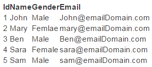
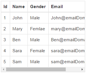
table class provides light padding and horizontal lines
Output :

table-striped class provides zebra-striping for the table rows
Output :

table-bordered class provide borders on all sides of the table and cells.
Output :

table-hover class provides highlighting of rows on hover
table-condensed class makes table more compact by cutting cell padding in half
Output :

To make a table responsive, place the table inside a <div> element, and apply table-responsive class on the <div> element. This will provide a horizontal scrollbar when the screen size is less than 768px (i.e on a small device). On a screen size larger than 768px you will not find any difference. Applying the table-responsive class directly on the table will not do anything useful.
Output :
Use the bootstrap contextual classes to colour the table rows
Output :

Bootstrap tutorial for beginners
Bootstrap classes for styling tables
Contextual classes to color table rows or individual cells
Here is the HTML for the table without any boostrap table classes
<table>
<thead>
<tr>
<th>Id</th>
<th>Name</th>
<th>Gender</th>
<th>Email</th>
</tr>
</thead>
<tbody>
<tr>
<td>1</td>
<td>John</td>
<td>Male</td>
<td>John@emailDomain.com</td>
</tr>
<tr>
<td>2</td>
<td>Mary</td>
<td>Femlae</td>
<td>mary@emailDomain.com</td>
</tr>
<tr>
<td>3</td>
<td>Ben</td>
<td>Male</td>
<td>Ben@emailDomain.com</td>
</tr>
<tr>
<td>4</td>
<td>Sara</td>
<td>Female</td>
<td>sara@emailDomain.com</td>
</tr>
<tr>
<td>5</td>
<td>Sam</td>
<td>Male</td>
<td>sam@emailDomain.com</td>
</tr>
</tbody>
</table>
Output :
table class provides light padding and horizontal lines
<table class="table">
<!--rest of the HTML stays the same-->
</table>
Output :
table-striped class provides zebra-striping for the table rows
<table class="table table-striped">
<!--rest of the HTML stays the same-->
</table>
Output :
table-bordered class provide borders on all sides of the table and cells.
<table class="table table-striped table-bordered">
<!--rest of the HTML stays the same-->
</table>
Output :
table-hover class provides highlighting of rows on hover
<table class="table table-bordered table-hover">
<!--rest of the HTML stays the same-->
</table>
table-condensed class makes table more compact by cutting cell padding in half
<table class="table table-bordered table-hover table-condensed">
<!--rest of the HTML stays the same-->
</table>
Output :
To make a table responsive, place the table inside a <div> element, and apply table-responsive class on the <div> element. This will provide a horizontal scrollbar when the screen size is less than 768px (i.e on a small device). On a screen size larger than 768px you will not find any difference. Applying the table-responsive class directly on the table will not do anything useful.
<div class="table-responsive">
<table class="table table-bordered table-hover">
<!--rest of the HTML stays the same-->
</table>
</div>
Output :
Use the bootstrap contextual classes to colour the table rows
<div class="table-responsive">
<table class="table table-bordered table-hover">
<thead>
<tr>
<th>Id</th>
<th>Name</th>
<th>Gender</th>
<th>Email</th>
</tr>
</thead>
<tbody>
<tr class="active">
<td>1</td>
<td>John</td>
<td>Male</td>
<td>John@emailDomain.com</td>
</tr>
<tr class="danger">
<td>2</td>
<td>Mary</td>
<td>Femlae</td>
<td>mary@emailDomain.com</td>
</tr>
<tr class="info">
<td>3</td>
<td>Ben</td>
<td>Male</td>
<td>Ben@emailDomain.com</td>
</tr>
<tr class="success">
<td>4</td>
<td>Sara</td>
<td>Female</td>
<td>sara@emailDomain.com</td>
</tr>
<tr class="warning">
<td>5</td>
<td>Sam</td>
<td>Male</td>
<td>sam@emailDomain.com</td>
</tr>
</tbody>
</table>
</div>
Output :


