In this we will discuss the different bootstrap button classes and their use
Bootstrap tutorial for beginners

Notice on the following elements we are not using any bootstrap classes.
By default the above elements will be styled as shown below.

Adding btn class applies bootstrap styles to the button and input elements.
Output :

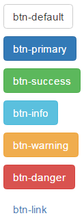
Bootstrap button classes : Along with the btn class, one of the following button classes can be used. The colour scheme you get depends on the class you use.

Example : To get the buttons lined up one below the other instead of being side-by-side, I have placed them inside a <p> element.
Output :
To make an anchor element look like a button, use btn class along with the other button classes (like btn-default, btn-primary etc.)
Output :

Changing Button Size : Use the following button classes to get large, small or extra small buttons

Output :

To create a button that span the full width of it's parent use btn-block class
Example : The following example displays
All the 4 buttons side by side in a single line on a large screen
3 buttons side by side in the first line and the last button in the second line on a medium screen
2 buttons side by side in the first line and the rest 2 buttons side by side in the second line on a small screen
All the 4 buttons one below the other on an extra small screen
What this example the button width is fixed
Here is customDiv class
We want the button width to span the full width of it's parent grid column. This can be very easily achieved by applying btn-blcok class on all the button elements.
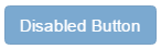
To disable a button set disabled attribute to disabled
Output : When you move the mouse over the disabled button, the cursor style changes to a stop sign, indicating that the button cannot be clicked.
To disable an anchor element use disabled class

Bootstrap tutorial for beginners
Notice on the following elements we are not using any bootstrap classes.
<button>Button</button>
<input type="button" value="Input">
<input type="submit" value="Submit">
By default the above elements will be styled as shown below.
Adding btn class applies bootstrap styles to the button and input elements.
<button class="btn">Button</button>
<input class="btn" type="button" value="Input">
<input class="btn" type="submit" value="Submit">
Output :
Bootstrap button classes : Along with the btn class, one of the following button classes can be used. The colour scheme you get depends on the class you use.
Example : To get the buttons lined up one below the other instead of being side-by-side, I have placed them inside a <p> element.
<p><button class="btn btn-default">btn-default</button></p>
<p><button class="btn btn-primary">btn-primary</button></p>
<p><button class="btn btn-success">btn-success</button></p>
<p><button class="btn btn-info">btn-info</button></p>
<p><button class="btn btn-warning">btn-warning</button></p>
<p><button class="btn btn-danger">btn-danger</button></p>
<p><button class="btn btn-link">btn-link</button></p>
Output :
To make an anchor element look like a button, use btn class along with the other button classes (like btn-default, btn-primary etc.)
<a href="#" class="btn btn-primary">Hyperlink</a>
Output :
Changing Button Size : Use the following button classes to get large, small or extra small buttons
<button class="btn btn-primary btn-lg">Large</button>
<button class="btn btn-primary btn-sm">Small</button>
<button class="btn btn-primary btn-xs">Extra Small</button>
Output :
To create a button that span the full width of it's parent use btn-block class
Example : The following example displays
All the 4 buttons side by side in a single line on a large screen
3 buttons side by side in the first line and the last button in the second line on a medium screen
2 buttons side by side in the first line and the rest 2 buttons side by side in the second line on a small screen
All the 4 buttons one below the other on an extra small screen
What this example the button width is fixed
<div class="container">
<div class="row">
<div class="col-lg-3 col-md-4 col-sm-6 col-xs-12">
<div class="customDiv">
<button class="btn btn-primary">Button 1</button>
</div>
</div>
<div class="col-lg-3 col-md-4 col-sm-6 col-xs-12">
<div class="customDiv">
<button class="btn btn-primary">Button 2</button>
</div>
</div>
<div class="col-lg-3 col-md-4 col-sm-6 col-xs-12">
<div class="customDiv">
<button class="btn btn-primary">Button 3</button>
</div>
</div>
<div class="col-lg-3 col-md-4 col-sm-6 col-xs-12">
<div class="customDiv">
<button class="btn btn-primary">Button 4</button>
</div>
</div>
</div>
</div>
Here is customDiv class
.customDiv{
padding:10px;
width:100%;
}
<div class="container">
<div class="row">
<div class="col-lg-3 col-md-4 col-sm-6 col-xs-12">
<div class="customDiv">
<button class="btn btn-primary btn-block">Button 1</button>
</div>
</div>
<div class="col-lg-3 col-md-4 col-sm-6 col-xs-12">
<div class="customDiv">
<button class="btn btn-primary btn-block">Button 2</button>
</div>
</div>
<div class="col-lg-3 col-md-4 col-sm-6 col-xs-12">
<div class="customDiv">
<button class="btn btn-primary btn-block">Button 3</button>
</div>
</div>
<div class="col-lg-3 col-md-4 col-sm-6 col-xs-12">
<div class="customDiv">
<button class="btn btn-primary btn-block">Button 4</button>
</div>
</div>
</div>
</div>
To disable a button set disabled attribute to disabled
<button class="btn btn-primary" disabled="disabled">Disabled Button</button>
Output : When you move the mouse over the disabled button, the cursor style changes to a stop sign, indicating that the button cannot be clicked.
To disable an anchor element use disabled class
<a href="#" class="btn btn-primary disabled">Hyperlink</a>


