In this we will discuss bootstrap input groups.
Bootstrap tutorial for beginners
Bootstrap Input Groups
1. Extend <input> elements by adding text, icons or buttons before, after, or on both sides of the <input> elements
2. Are limited to textual <input> elements only
3. Avoid using <select> and <textarea> elements as they are not fully supported by some browsers
To add text before any text-based <input> element
1. Wrap the <input> element to which you want to add text, inside a <div> element with class=input-group
2. Wrap the text within a <span> element with class=input-group-addon and place it before the <input> element
To add text after the <input> element, place the <span> element after the <input> element

To add text on bot the sides of the <input> element, place the <span> element on both the sides of the <input> element
To add an icon to the <input> element, create a <span> element with class="The Glyphicon Name" and place it inside the <span> element that has the class input-group-addon

A checkbox or a radio button can also be used as an add-on, instead of text or icons. To append a checkbox to an <input> element, place the checkbox inside the <span> element that has the class input-group-addon

As you might have guessed by now, to append a radio button, simply place the radio button inside the <span> element that has the class input-group-addon

For sizing the elements in an input group, use input-group-lg or input-group-sm classes on the input-group. This will size all the elements accordingly in that input-group. There is no need to apply the size classes on each element in the input-group.
Bootstrap tutorial for beginners
Bootstrap Input Groups
1. Extend <input> elements by adding text, icons or buttons before, after, or on both sides of the <input> elements
2. Are limited to textual <input> elements only
3. Avoid using <select> and <textarea> elements as they are not fully supported by some browsers
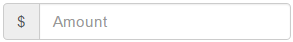
To add text before any text-based <input> element
1. Wrap the <input> element to which you want to add text, inside a <div> element with class=input-group
2. Wrap the text within a <span> element with class=input-group-addon and place it before the <input> element
<div class="input-group">
<span class="input-group-addon">$</span>
<input type="text" class="form-control" placeholder="Amount">
</div>
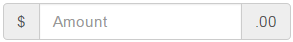
To add text after the <input> element, place the <span> element after the <input> element
<div class="input-group">
<input type="text" class="form-control" placeholder="Amount">
<span class="input-group-addon">.00</span>
</div>
To add text on bot the sides of the <input> element, place the <span> element on both the sides of the <input> element
<div class="input-group">
<span class="input-group-addon">$</span>
<input type="text" class="form-control" placeholder="Amount">
<span class="input-group-addon">.00</span>
</div>
To add an icon to the <input> element, create a <span> element with class="The Glyphicon Name" and place it inside the <span> element that has the class input-group-addon
<div class="input-group">
<span class="input-group-addon">
<span class="glyphicon glyphicon-envelope"></span>
</span>
<input type="text" class="form-control" placeholder="Amount">
</div>
A checkbox or a radio button can also be used as an add-on, instead of text or icons. To append a checkbox to an <input> element, place the checkbox inside the <span> element that has the class input-group-addon
<div class="input-group">
<span class="input-group-addon">
<input type="checkbox" />
</span>
<input type="text" class="form-control" placeholder="Amount">
</div>
As you might have guessed by now, to append a radio button, simply place the radio button inside the <span> element that has the class input-group-addon
<div class="input-group">
<span class="input-group-addon">
<input type="radio" />
</span>
<input type="text" class="form-control" placeholder="Amount">
</div>
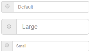
For sizing the elements in an input group, use input-group-lg or input-group-sm classes on the input-group. This will size all the elements accordingly in that input-group. There is no need to apply the size classes on each element in the input-group.
<div class="input-group">
<span class="input-group-addon">
<input type="radio" />
</span>
<input type="text" class="form-control" placeholder="Default">
</div>
<br />
<div class="input-group input-group-lg">
<span class="input-group-addon">
<input type="radio" />
</span>
<input type="text" class="form-control" placeholder="Large">
</div>
<br />
<div class="input-group input-group-sm">
<span class="input-group-addon">
<input type="radio" />
</span>
<input type="text" class="form-control" placeholder="Small">
</div>


