In this , we will discuss the bootstrap classes that can be used to style the form controls based on their validation state.
Bootstrap tutorial for beginners
The following are the boostrap classes and glyphicons that can be used to style the form controls depending on the validation state i.e success, warning or error
The following example, styles the form controls depending on their validation state. The bootstrap validation classes (has-success, has-warning & has-error) are being used on the parent <div> element. We are also using help-block class to display the help text associated with the form control.

In the following example, we are also displaying the validation icons depending on the validation state of the control. To use icons we also have to use has-feedback and form-control-feedback classes. Please note that Icons only work with textual <input> elements

The following example, styles the input groups depending on their validation state. As you can see, styling input groups is similar to styling regular form controls.
Bootstrap tutorial for beginners
The following are the boostrap classes and glyphicons that can be used to style the form controls depending on the validation state i.e success, warning or error
| Class | Glyphicon | Purpose |
|---|---|---|
| has-success | glyphicon glyphicon-ok | Success Validation State |
| has-warning | glyphicon glyphicon-warning-sign | Warning Validation State |
| has-error | glyphicon glyphicon-remove | Error Validation State |
The following example, styles the form controls depending on their validation state. The bootstrap validation classes (has-success, has-warning & has-error) are being used on the parent <div> element. We are also using help-block class to display the help text associated with the form control.
<form class="form-horizontal">
<div class="form-group has-success">
<label class="col-xs-2 control-label" for="txtStrongPassword">Password</label>
<div class="col-xs-10">
<input type="password" id="txtStrongPassword" class="form-control"
placeholder="Your password">
<span class="help-block">Strong Password</span>
</div>
</div>
<div class="form-group has-warning">
<label class="col-xs-2 control-label" for="txtWeakPassword">Password</label>
<div class="col-xs-10">
<input type="password" id="txtWeakPassword" class="form-control"
placeholder="Your password">
<span class="help-block">Weak Password</span>
</div>
</div>
<div class="form-group has-error">
<label class="col-xs-2 control-label" for="txtAge">Age</label>
<div class="col-xs-10">
<input type="number" id="txtAge" class="form-control"
placeholder="Your Age">
<span class="help-block">Invalid Age</span>
</div>
</div>
</form>
In the following example, we are also displaying the validation icons depending on the validation state of the control. To use icons we also have to use has-feedback and form-control-feedback classes. Please note that Icons only work with textual <input> elements
<form class="form-horizontal">
<div class="form-group has-success has-feedback">
<label class="col-xs-2 control-label" for="txtStrongPassword">Password</label>
<div class="col-xs-10">
<input type="password" id="txtStrongPassword" class="form-control"
placeholder="Your password">
<span class="glyphicon glyphicon-ok form-control-feedback"></span>
<span class="help-block">Strong Password</span>
</div>
</div>
<div class="form-group has-warning has-feedback">
<label class="col-xs-2 control-label" for="txtWeakPassword">Password</label>
<div class="col-xs-10">
<input type="password" id="txtWeakPassword" class="form-control"
placeholder="Your password">
<span class="glyphicon glyphicon-warning-sign form-control-feedback"></span>
<span class="help-block">Weak Password</span>
</div>
</div>
<div class="form-group has-error has-feedback">
<label class="col-xs-2 control-label" for="txtAge">Age</label>
<div class="col-xs-10">
<input type="number" id="txtAge" class="form-control"
placeholder="Your Age">
<span class="glyphicon glyphicon-remove form-control-feedback"></span>
<span class="help-block">Invalid Age</span>
</div>
</div>
</form>
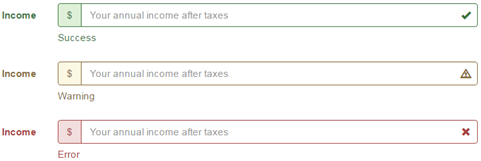
The following example, styles the input groups depending on their validation state. As you can see, styling input groups is similar to styling regular form controls.
<form class="form-horizontal">
<div class="form-group has-success has-feedback">
<label class="col-xs-2 control-label" for="txtStrongPassword">Income</label>
<div class="col-xs-10">
<div class="input-group">
<span class="input-group-addon">$</span>
<input type="text" id="txtIncome" class="form-control"
placeholder="Your annual income after taxes">
</div>
<span class="glyphicon glyphicon-ok form-control-feedback"></span>
<span class="help-block">Success</span>
</div>
</div>
<div class="form-group has-warning has-feedback">
<label class="col-xs-2 control-label" for="txtStrongPassword">Income</label>
<div class="col-xs-10">
<div class="input-group">
<span class="input-group-addon">$</span>
<input type="text" id="txtIncome" class="form-control"
placeholder="Your annual income after taxes">
</div>
<span class="glyphicon glyphicon-warning-sign form-control-feedback"></span>
<span class="help-block">Warning</span>
</div>
</div>
<div class="form-group has-error has-feedback">
<label class="col-xs-2 control-label" for="txtStrongPassword">Income</label>
<div class="col-xs-10">
<div class="input-group">
<span class="input-group-addon">$</span>
<input type="text" id="txtIncome" class="form-control"
placeholder="Your annual income after taxes">
</div>
<span class="glyphicon glyphicon-remove form-control-feedback"></span>
<span class="help-block">Error</span>
</div>
</div>
</form>


