In this Ionic 5/4 tutorial, we’ll discuss how to create a dynamic list of radio button lists using groups in Ionic Angular application. In Ionic Framework we use the ion-radio and ion-radio-group to create a radio control field component.
This Angular post is compatible with Angular 4 upto latest versions, Angular 7, Angular 8, Angular 9, Angular 10, Angular 11 & Angular 12
Radio control is used to select a single value from a group of selection controls. The radio is generally depicted as a round circular interactive control using which a user can select a value from varied options available. This is mainly required where we are supposed to get only a single option out of multiple offerings in a form.
Ionic framework provided us the ion-radio UI component using which we can create a Radio control. The multiple set of radio controls are wrapped into a group with the ion-radio-group directive component. Thes directive components provide a wide variety of properties, events, and methods to use them efficiently in the real application.
We can add Radio form fields by simply adding <ion-radio> directive in web component which is converted into a customized Radio element.
Setup a new Ionic application
We’ll create a new Ionic application using Angular framework, with a starter blank template. You can update your Ionic CLI by hitting below command
$ npm install -g @ionic/cliCreate a new application
$ ionic start ionic-radio-button-group-list blank --type=angularMove-in the application folder
$ cd ionic-radio-button-group-list
Adding Ionic Radio Lists using Groups
Home Template HTML
The radio control is created by adding the ion-radio component, we are creating t dynamic list of Radio controls using the *ngFor directive and iterating them in the ion-list Ionic UI component. This dynamic list of radio controls is wrapped inside the ion-radio-group directive component.
Open the home.page.html file, then place following HTML code
<ion-header [translucent]="true">
<ion-toolbar>
<ion-title>
Ionic Radio List
</ion-title>
</ion-toolbar>
</ion-header>
<ion-content [fullscreen]="true" class="ion-padding">
<ion-list>
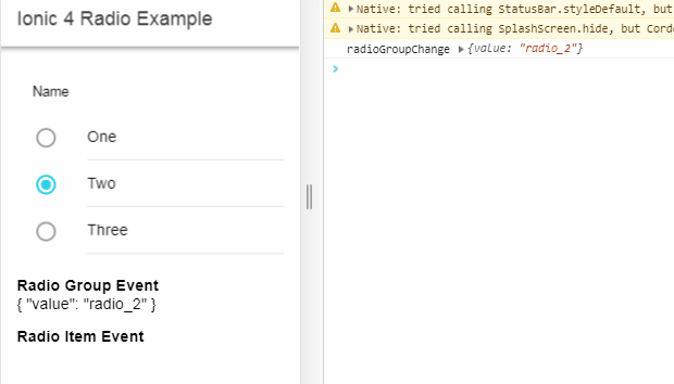
<ion-radio-group allow-empty-selection="true" name="radio-group" (ionChange)="radioGroupChange($event)" #radioGroup>
<ion-list-header>
<ion-label>Name</ion-label>
</ion-list-header>
<ion-item *ngFor="let item of radio_list" (ionFocus)="radioFocus()" (ionSelect)="radioSelect($event)"
(ionBlur)="radioBlur()">
<ion-label>{{item.text}}</ion-label>
<ion-radio slot="start" name="{{item.name}}" value="{{item.value}}" checked="{{item.checked}}"
color="{{item.color}}" disabled="{{item.disabled}}"></ion-radio>
</ion-item>
</ion-radio-group>
</ion-list>
<p><b>Radio Group Event</b><br />
{{selectedRadioGroup | json}}</p>
<p><b>Radio Item Event</b><br />
{{selectedRadioItem | json}}</p>
</ion-content>Let’s discuss the ion-radio & ion-radio-group UI component supported Events, Properties, and Methods:
The Ion Radio Component
The <ion-radio> is used to create a single radio item with following available events and properties
Properties
checked:Default state of radio (true|false). Only one radio can be checked at a time.color:Change color to available theme options | “primary“, “secondary“, “tertiary“, “success“, “warning“, “danger“, “light“disabled:Set to true to disable the radio controlname:Used when form data need to be passed used as a keyvalue:Used to pass form data used as the value of the key
Events
(ionBlur): Emitted when the radio button loses focus.(ionFocus): Emitted when the radio button has focus.(ionSelect): Emitted when the radio button is selected.
The Ion Radio Group
The <ion-radio-group>is used to wrap a set of radio items, to ensure only one item is selected. The following are some properties and events available on the radio group.
Properties
allow-empty-selection: If set to true, radio can be deselected like a checkbox.name: Used when form data need to be passed used as a keyvalue: Used to pass form data used as the value of a key
Events
(ionChange): Emitted when the value has changed.
Home Class Component
In the home.page.ts file add the following code
//home.page.ts
import { Component } from '@angular/core';
@Component({
selector: 'app-home',
templateUrl: 'home.page.html',
styleUrls: ['home.page.scss'],
})
export class HomePage {
defaultSelectedRadio = "radio_2";
//Get value on ionChange on IonRadioGroup
selectedRadioGroup:any;
//Get value on ionSelect on IonRadio item
selectedRadioItem:any;
radio_list = [
{
id: '1',
name: 'radio_list',
value: 'radio_1',
text: 'One',
disabled: false,
checked: false,
color: 'primary'
}, {
id: '2',
name: 'radio_list',
value: 'radio_2',
text: 'Two',
disabled: false,
checked: true,
color: 'secondary'
}, {
id: '3',
name: 'radio_list',
value: 'radio_3',
text: 'Three',
disabled: false,
checked: false,
color: 'danger'
},
];
radioGroupChange(event) {
console.log("radioGroupChange",event.detail);
this.selectedRadioGroup = event.detail;
}
radioFocus() {
console.log("radioFocus");
}
radioSelect(event) {
console.log("radioSelect",event.detail);
this.selectedRadioItem = event.detail;
}
radioBlur() {
console.log("radioBlur");
}
}
In the radio_list object, we are having some properties to control the state of each traversed radio control in the list
disabled:If set to true that radio will be in a disabled state by default.checked:If set to true that radio will be checked by default on component load.color:Set the color of the radio.
Here we are also getting selected radio item value from the radio group event (ionChange) and radio item using (ionSelect)
The allow-empty-selection property enables the user to deselect the radio control after selection which is opposite to the natural behavior of a radio, but we can also achieve this.
How to get the value of selected Radio control in the List?
We have a (ionChange) event handler on the ion-radio-group component which will return the selected radio items value on change.
How to Select Ionic 4 Radio on Button Click Programmatically?
We can access Radio group using a template variable #ionRadioGroup then define it in component as @ViewChild using IonRadioGroup
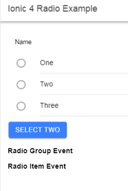
<ion-list>
<ion-radio-group allow-empty-selection="true" name="radio-group" (ionChange)="radioGroupChange($event)" #radioGroup>
...
</ion-radio-group>
</ion-list>
<ion-button (click)="selectTwo()">Select Second Radio</ion-button>Then in home.page.ts define @ViewChild
//home.page.ts
import { Component, ViewChild } from '@angular/core';
import { IonRadioGroup } from '@ionic/angular';
@Component({
selector: 'app-home',
templateUrl: 'home.page.html',
styleUrls: ['home.page.scss'],
})
export class HomePage {
@ViewChild('radioGroup') radioGroup: IonRadioGroup
//Get value on ionChange on IonRadioGroup
selectedRadioGroup:any;
//Get value on ionSelect on IonRadio item
selectedRadioItem:any;
radio_list = [
{
id: '1',
name: 'radio_list',
value: 'radio_1',
text: 'One',
disabled: false,
checked: false,
color: 'primary'
}, {
id: '2',
name: 'radio_list',
value: 'radio_2',
text: 'Two',
disabled: false,
checked: false,
color: 'secondary'
}, {
id: '3',
name: 'radio_list',
value: 'radio_3',
text: 'Three',
disabled: false,
checked: false,
color: 'danger'
},
];
radioGroupChange(event) {
console.log("radioGroupChange",event.detail);
this.selectedRadioGroup = event.detail;
}
radioFocus() {
console.log("radioFocus");
}
radioSelect(event) {
console.log("radioSelect",event.detail);
this.selectedRadioItem = event.detail;
}
radioBlur() {
console.log("radioBlur");
}
selectTwo(){
this.radioGroup.value = 'radio_2'
}
}
That’s it now you can run the Ionic application by hitting $ ionic serve --o see it in action.
Source Code
Find the source code of this tutorial in the GitHub repository here.
Conclusion
Finally, we have completed our Ionic Radio List Group tutorial and discussed how we can use the ion-radio and ion-radio-group UI component with several properties and even handling. We created the radio list using the ion-list component with dynamic data using *ngFor Angular directive.
If you find this helpful, please share it with others and do comment on your feedback and suggestion to improve this write.
Thanks for reading!