In this we will discuss the Bootstrap tooltip plugin.
Bootstrap tutorial for beginners
To create a tooltip
1. Include title attribute on the element. The title attribute value will be displayed as the tooltip.
2. Also, include data-toggle="tooltip" on the element
3. Finally, initialize the tooltip, using the following one line of jQuery code
$('[data-toggle="tooltip"]').tooltip();
HTML
jQuery Code :
By default, the tooltip is displayed on top of the element. We can customize it to be at the bottom, left or right of the element. To customize the tooltip placement use data-placement attribute. The values of this attribute are top, bottom, left or right.
Options to customize tooltip behaviour. These options can be specified using data attributes or Javascript.
In the following example we are using title option. For the title option value to show up as the tooltip, please remove the title attribute from the element.
HTML
jQuery Code
In the following example we are using placement option to place the tooltip on the right side of the element.
In the following example we have set animation=false. This removes the fade animation. As a result, the tooltip appears and disappears immediately.
In the following example we have set animation=true and delay = { show: 500, hide: 800 }. With these 2 options, there will be a delay of 500 milli-seconds to show the tooltip and a delay of 800 milli-seconds to hide the tooltip.
In the example below, we are using HTML tags in the title option, but we have not set HTML option to true. As a result the HTML will be displayed as is in the tooltip.

For this to work correctly set HTML option to true.
Bootstrap tutorial for beginners
To create a tooltip
1. Include title attribute on the element. The title attribute value will be displayed as the tooltip.
2. Also, include data-toggle="tooltip" on the element
3. Finally, initialize the tooltip, using the following one line of jQuery code
$('[data-toggle="tooltip"]').tooltip();
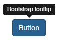
HTML
<button class="btn btn-primary" title="Bootstrap tooltip"
data-toggle="tooltip">
Button
</button>
jQuery Code :
<script type="text/javascript">
$(document).ready(function () {
$('[data-toggle="tooltip"]').tooltip();
});
</script>
By default, the tooltip is displayed on top of the element. We can customize it to be at the bottom, left or right of the element. To customize the tooltip placement use data-placement attribute. The values of this attribute are top, bottom, left or right.
<button class="btn btn-primary" title="Bootstrap tooltip" data-toggle="tooltip"
data-placement="right">
Button
</button>
Options to customize tooltip behaviour. These options can be specified using data attributes or Javascript.
| Option | Description |
|---|---|
| placement | Placement can be top, bottom, left or right. Default is top |
| title | Title for the tooltip |
| animation | Animates the tooltip. Value can be true or false. Default is true |
| delay | Time delay for showing and hiding the tooltip. Value can be number in milli-seconds or an object |
| html | Specifies the HTML for the tooltip. Value can be true or false. Default is false |
In the following example we are using title option. For the title option value to show up as the tooltip, please remove the title attribute from the element.
HTML
<button class="btn btn-primary" data-toggle="tooltip">
Button
</button>
jQuery Code
$(document).ready(function () {
$('[data-toggle="tooltip"]').tooltip({
title: 'Tooltip from title option'
});
});
In the following example we are using placement option to place the tooltip on the right side of the element.
$(document).ready(function () {
$('[data-toggle="tooltip"]').tooltip({
title: 'Tooltip from title option',
placement: 'right'
});
});
In the following example we have set animation=false. This removes the fade animation. As a result, the tooltip appears and disappears immediately.
$(document).ready(function () {
$('[data-toggle="tooltip"]').tooltip({
title: 'Tooltip from title option',
placement: 'right',
animation: false
});
});
In the following example we have set animation=true and delay = { show: 500, hide: 800 }. With these 2 options, there will be a delay of 500 milli-seconds to show the tooltip and a delay of 800 milli-seconds to hide the tooltip.
$(document).ready(function () {
$('[data-toggle="tooltip"]').tooltip({
title: 'Tooltip from title option',
placement: 'right',
animation: true,
delay: { show: 500, hide: 800 }
});
});
In the example below, we are using HTML tags in the title option, but we have not set HTML option to true. As a result the HTML will be displayed as is in the tooltip.
$(document).ready(function () {
$('[data-toggle="tooltip"]').tooltip({
title: '<h3>Help</h3><p>Click to submit the page</p>',
placement: 'right',
animation: true,
delay: { show: 500, hide: 800 }
});
});
For this to work correctly set HTML option to true.
$(document).ready(function () {
$('[data-toggle="tooltip"]').tooltip({
title: '<h3>Help</h3><p>Click to submit the page</p>',
placement: 'right',
animation: true,
delay: { show: 500, hide: 800 },
html: true
});
});


