In previous tutorial, we discussed using using the Scrollspy plugin with horizontal navigation menu. In this video we will discuss using it with a vertical navigation menu.
Bootstrap tutorial for beginners
If you want the navigation menu on the right hand side, place the <div> element with class col-xs-3 after the <div> element with class col-xs-9
Bootstrap tutorial for beginners
<!doctype html>
<html>
<head>
<meta name="viewport" content="width=device-width, initial-scale=1">
<title>Bootstrap tutorial for begineers</title>
<link href="bootstrap/css/bootstrap.min.css" rel="stylesheet">
<link href="CustomStyles.css" rel="stylesheet" />
<style type="text/css">
body {
position: relative;
}
#mainNavbar {
top: 20px;
position: fixed;
}
</style>
</head>
<body>
<div class="container">
<div class="row">
<div class="col-xs-3">
<nav id="mainNavbar">
<ul class="nav nav-pills nav-stacked">
<li class="active"><a href="#divDesert">Desert</a></li>
<li><a href="#divLighthouse">Lighthouse</a></li>
<li><a href="#divTulips">Tulips</a></li>
<li class="dropdown">
<a href="#" class="dropdown-toggle" data-toggle="dropdown">
Animals <span class="caret"></span>
</a>
<ul class="dropdown-menu">
<li><a href="#divJellyfish">Jellyfish</a></li>
<li><a href="#divPenguins">Penguins</a></li>
</ul>
</li>
</ul>
</nav>
</div>
<div class="col-xs-9">
<div id="divDesert">
<h1>Desert</h1>
<img src="Images/Desert.jpg" class="img-responsive" />
</div>
<div id="divLighthouse">
<h1>Lighthouse</h1>
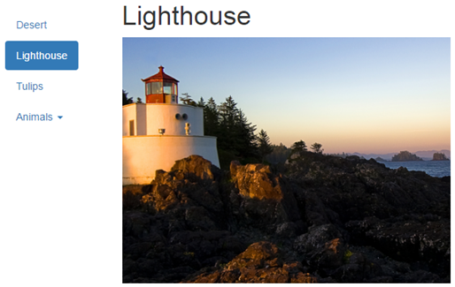
<img src="Images/Lighthouse.jpg" class="img-responsive" />
</div>
<div id="divTulips">
<h1>Tulips</h1>
<img src="Images/Tulips.jpg" class="img-responsive" />
</div>
<div id="divJellyfish">
<h1>Jellyfish</h1>
<img src="Images/Jellyfish.jpg" class="img-responsive" />
</div>
<div id="divPenguins">
<h1>Penguins</h1>
<img src="Images/Penguins.jpg" class="img-responsive" />
</div>
</div>
</div>
</div>
<script src="https://ajax.googleapis.com/ajax/libs/jquery/1.11.3/jquery.min.js">
</script>
<script src="bootstrap/js/bootstrap.min.js"></script>
<script type="text/javascript">
$(document).ready(function () {
$('body').scrollspy({
target: '#mainNavbar',
offset: 10
});
});
</script>
</body>
</html>
If you want the navigation menu on the right hand side, place the <div> element with class col-xs-3 after the <div> element with class col-xs-9


