In this we will discuss the standard form controls supported by bootstrap
Bootstrap tutorial for beginners
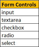
Bootstrap supports all the following standard form controls
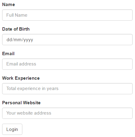
Input : In Part 20 of Bootstrap tutorial, we used <input type="text"> and <input type="password">. In addition to these 2 types all the other HTML5 types like date, number, email, url etc are also supported. Please note that the type attribute is required for bootstrap to fully style the input element.
Here is a form with a few of the input types
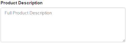
Textarea : Use to capture multiple lines of text from the user.
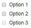
Checkboxes : Use when you want the user to select any number of options from the list of available options. The last option in the example below is disabled. To disable a checkbox, use disabled attribute on the checkbox. If you also want the cursor to be disabled on hover, then use disabled class on the parent <div> element of the checkbox.
If you want the checkboxes to appear side-by-side on the same line, use checkbox-inline class

Radio Buttons : Use when you want the user to select ONLY ONE option from the list of available options. The last option in the example below is disabled. To disable a radio button, use disabled attribute on the radio button. If you also want the cursor to be disabled on hover, then use disabled class on the parent <div> element of the radio button.
If you want the radio buttons to appear side-by-side on the same line, use radio-inline class
Single Select List or Single Select DropDownList : Use when you want the user to select one option from the list of available options.
Multi-Select List : Use when you want the user to select any number of options from the list of available options. To select multiple options, hold down the CTRL key. For a multi-select list, use the multiple attribute on the <select> element.

Bootstrap tutorial for beginners
Bootstrap supports all the following standard form controls
Input : In Part 20 of Bootstrap tutorial, we used <input type="text"> and <input type="password">. In addition to these 2 types all the other HTML5 types like date, number, email, url etc are also supported. Please note that the type attribute is required for bootstrap to fully style the input element.
Here is a form with a few of the input types
<form>
<div class="form-group">
<label for="inputName">Name</label>
<input class="form-control" type="text" id="inputName"
placeholder="Full Name" />
</div>
<div class="form-group">
<label for="inputDOB">Date of Birth</label>
<input class="form-control" type="date" id="inputDOB" />
</div>
<div class="form-group">
<label for="inputEmail">Email</label>
<input class="form-control" type="email" id="inputEmail"
placeholder="Email address" />
</div>
<div class="form-group">
<label for="inputExperience">Work Experience</label>
<input class="form-control" type="number" id="inputExperience"
placeholder="Total experience in years" />
</div>
<div class="form-group">
<label for="inputUrl">Personal Website</label>
<input class="form-control" type="url" id="inputUrl"
placeholder="Your website address" />
</div>
<button type="submit" class="btn btn-default">Login</button>
</form>
Textarea : Use to capture multiple lines of text from the user.
<div class="form-group">
<label for="inputDescription">Product Description</label>
<textarea class="form-control" id="inputDescription" rows="5"
placeholder="Full Product Description"></textarea>
</div>
Checkboxes : Use when you want the user to select any number of options from the list of available options. The last option in the example below is disabled. To disable a checkbox, use disabled attribute on the checkbox. If you also want the cursor to be disabled on hover, then use disabled class on the parent <div> element of the checkbox.
<div class="checkbox">
<label>
<input type="checkbox" value="option1">
Option 1
</label>
</div>
<div class="checkbox">
<label>
<input type="checkbox" value="option2">
Option 2
</label>
</div>
<div class="checkbox disabled">
<label>
<input type="checkbox" value="option3" disabled>
Option 3
</label>
</div>
If you want the checkboxes to appear side-by-side on the same line, use checkbox-inline class
<label class="checkbox-inline">
<input type="checkbox" value="option1">Option 1
</label>
<label class="checkbox-inline">
<input type="checkbox" value="option2">Option 2
</label>
<label class="checkbox-inline">
<input type="checkbox" value="option3">Option 3
</label>
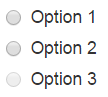
Radio Buttons : Use when you want the user to select ONLY ONE option from the list of available options. The last option in the example below is disabled. To disable a radio button, use disabled attribute on the radio button. If you also want the cursor to be disabled on hover, then use disabled class on the parent <div> element of the radio button.
<div class="radio">
<label>
<input type="radio" name="radioGroup" id="opt1" value="1">
Option 1
</label>
</div>
<div class="radio">
<label>
<input type="radio" name="radioGroup" id="opt2" value="2">
Option 2
</label>
</div>
<div class="radio disabled">
<label>
<input type="radio" name="radioGroup" id="opt3" value="3" disabled>
Option 3
</label>
</div>
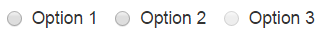
If you want the radio buttons to appear side-by-side on the same line, use radio-inline class
<label class="radio-inline">
<input type="radio" name="radioGroup" id="opt1" value="1">
Option 1
</label>
<label class="radio-inline">
<input type="radio" name="radioGroup" id="opt2" value="2">
Option 2
</label>
<label class="radio-inline">
<input type="radio" name="radioGroup" id="opt3" value="3" disabled>
Option 3
</label>
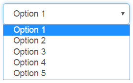
Single Select List or Single Select DropDownList : Use when you want the user to select one option from the list of available options.
<select class="form-control">
<option>Option 1</option>
<option>Option 2</option>
<option>Option 3</option>
<option>Option 4</option>
<option>Option 5</option>
</select>
Multi-Select List : Use when you want the user to select any number of options from the list of available options. To select multiple options, hold down the CTRL key. For a multi-select list, use the multiple attribute on the <select> element.
<select multiple class="form-control">
<option>Option 1</option>
<option>Option 2</option>
<option>Option 3</option>
<option>Option 4</option>
<option>Option 5</option>
</select>


